
~/guides/MAC.md
Use the apple-design skill to have Claude Code review your site: say "review my site" first, then fix only what it flags
A free GitHub skill turns Apple's WWDC design talks into 17 sections of rules. Install it in one line, ask for a review, then fix only what you agree with.
Watch the reel on InstagramComment #MAC to get this guide
If you want your website to feel as polished as Apple's, the first idea is usually to hire a designer. This time I tried something else: in Claude Code, I used a skill called apple-design and asked Claude to review my own website against Apple's design rules. It came back with 17 issues, each with the section it came from and a fix. I picked 3 and applied them: a focus ring on the search box, press feedback, and stronger contrast for grey text and the button. This is the full version of the MAC reel: where to find the skill, how to install it in one line, how to ask for the review and how to choose what to fix. The key idea fits in one sentence: don't ask it to redo the whole page, ask it to review first. Every screenshot below is from our real run on 23 October 2026.
01The result first: 17 findings, I fixed 3
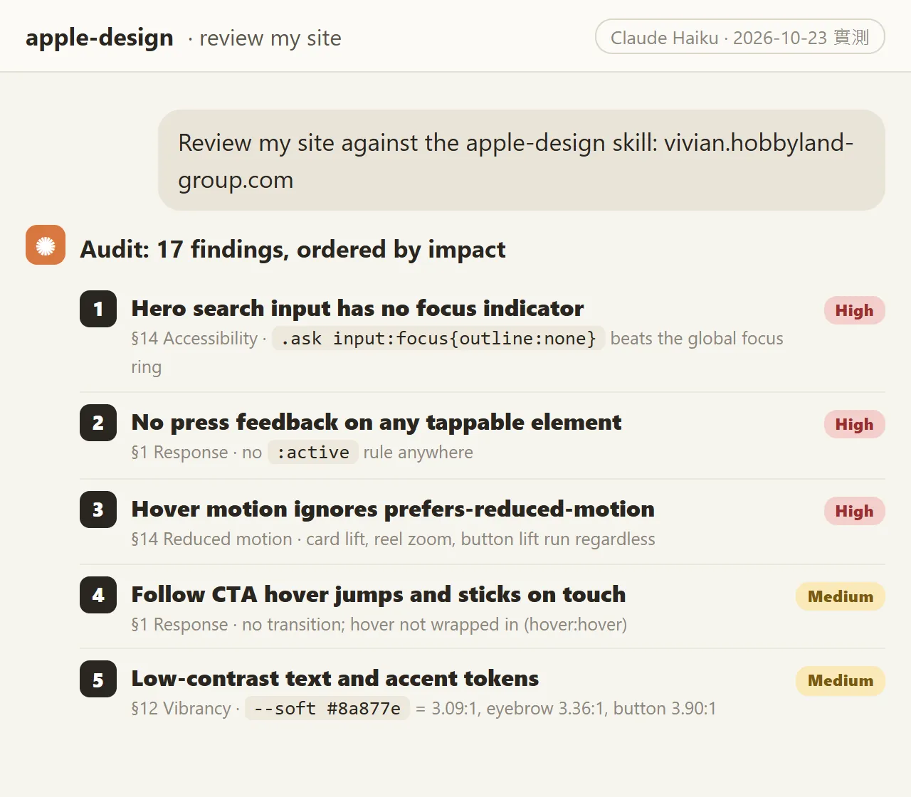
I asked Claude to review the home page of vivian.hobbyland-group.com against this skill. It returned 17 findings, sorted by impact, each naming the section of the skill it came from and giving a CSS fix. The top two were both High: the search box shows no focus ring when you click into it, and nothing on the page reacts when you press it.

What changed? Not the whole look of the page, just the details. When you tab or click into the search box, you can now see the outline. Grey text and the send button have more contrast. Cards and buttons shrink slightly when pressed, so your finger knows it hit something. I made all three changes on a copy of the site to check the result first; the live site gets them separately.
In this guide you'll get:
- Where the apple-design skill lives and what its 17 sections cover.
- The one-line install command from the README, and what it asks you while installing.
- A review prompt you can copy: review only, no changes yet.
- How to choose fixes, plus the CSS and contrast numbers for the 3 we applied.
- How to check the result yourself, and what to watch out for.
02What apple-design is: a skill built from Apple's WWDC design talks
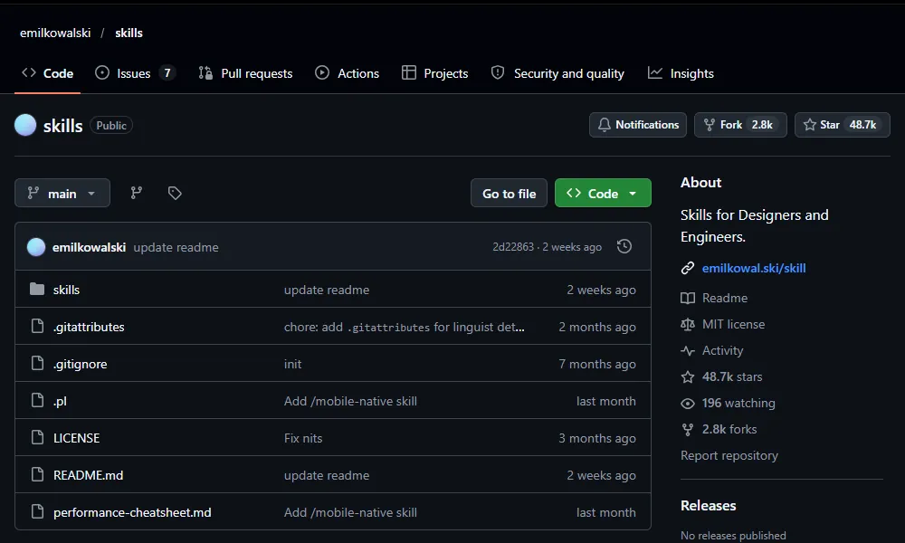
A skill is a set of instructions written for an AI, which Claude Code reads in and follows when it's needed. apple-design is a skill that designer Emil Kowalski publishes on GitHub, in a repo called emilkowalski/skills. It's MIT licensed and free to use.
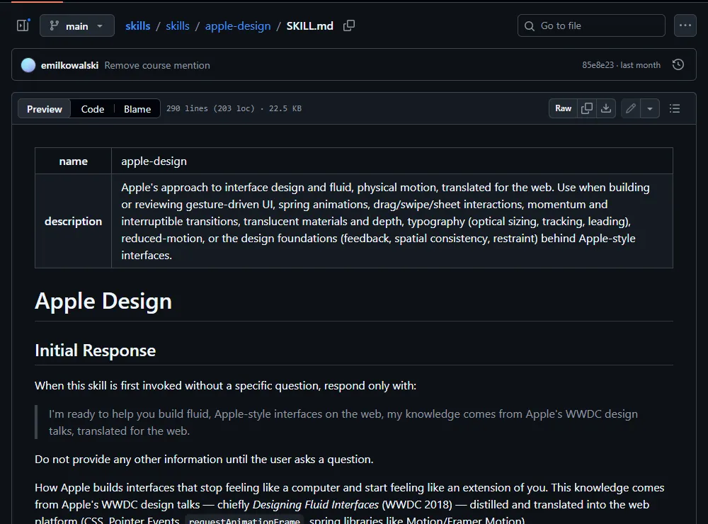
The file says it plainly: the content comes from Apple's WWDC design talks, chiefly Designing Fluid Interfaces from 2018, translated into web techniques (CSS, Pointer Events and so on). The body has 17 sections. These are the ones that matter most for a website:
- Section 1, Response: react the moment something is pressed.
- Section 11, Frame-level smoothness: motion should be smooth, never janky.
- Section 12, Materials & depth: use translucency and layering to show hierarchy.
- Section 14, Reduced motion & accessibility: look after people who turn off animation or use a keyboard.
- Section 15, Typography: size, tracking and leading.
- Section 16, Design foundations: feedback, consistency, restraint and the other basics.
03Step 1: install it with one command
First make sure Node.js is installed, because you need npx. The installer is a tool called skills, and its docs ask for Node.js 22.20 or later. Then open a terminal, go to your website's project folder and paste the one line from the README:
npx skills@latest add emilkowalski/skills
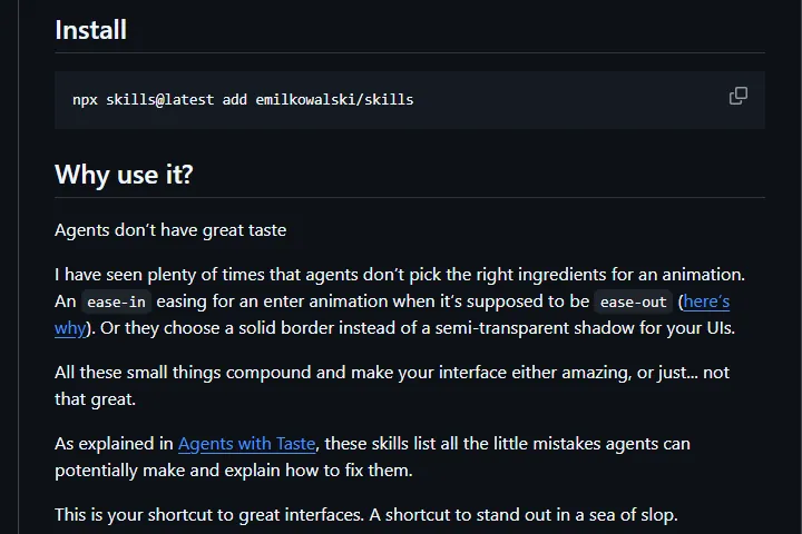
- When it runs, it asks which skills to install. The repo also has animation and UI skills; if you only want this one, pick apple-design.
- Next it asks which AI tool to install for. Pick Claude Code.
- By default it installs into the current project. To make it available in every project, the skills tool's docs say to add -g.
- Restart Claude Code, then type /apple-design in the chat box, or write "use the apple-design skill" in your prompt, and it will read the rules.
04Step 2: ask for a review, not a full redo
This is the most important step. Many people install it and say "redo my site in Apple's style". It may then swap out the whole page, including the parts you liked. The better move is to ask for a review first: list the problems and don't touch the code yet.
Use the apple-design skill to review my site [e.g. the home page index.html / the whole src folder]. List everything that doesn't follow it, which section each issue comes from, and a fix for each, sorted by impact. Don't change any code yet.
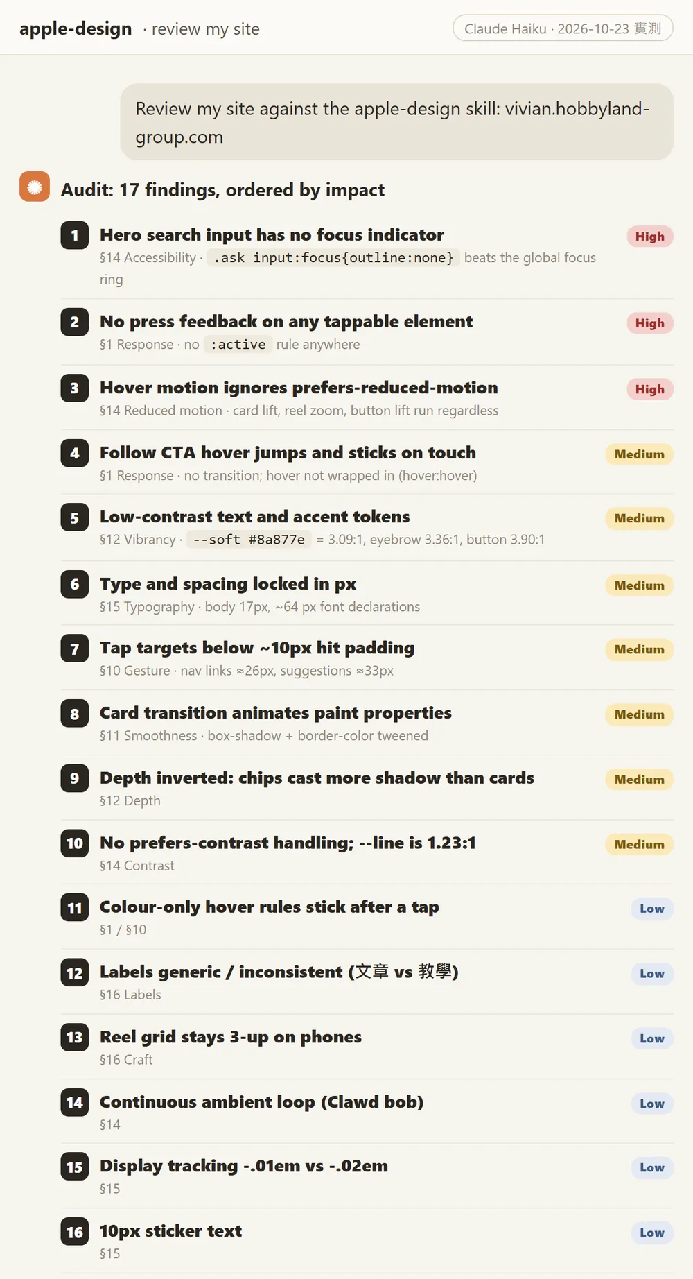
The list is useful on its own. Even if you fix nothing, you'll know where your site falls short. Mine flagged things I had never noticed, like nav links on phones being too small to tap easily, and cards still lifting on hover for people who've turned animation off.
05Step 3: fix only the items you agree with
Read the list and pick the items you understand and agree with. I picked 3, because the before and after are easy to see and none of them touch the page layout:
From the review list you just gave me, fix only items [1, 2, 5] and leave everything else alone. For each fix, tell me which line you changed and why.
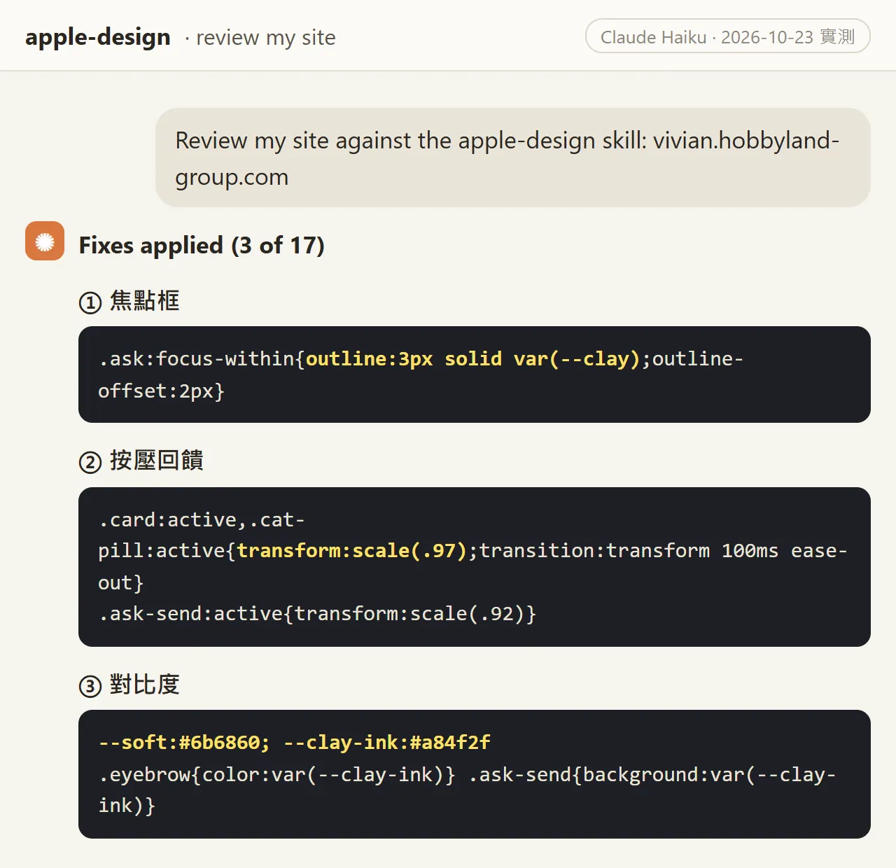
- 1. Focus ring: the old CSS turned off the search box outline (outline:none), so you couldn't tell it was selected. The fix adds a 3px orange ring around the whole search box when it's focused.
- 2. Press feedback: the page had no :active rules at all. The fix makes cards and category buttons shrink to 97% when pressed and the send button to 92%, for about 0.1 seconds.
- 3. Contrast: grey text went from #8a877e to #6b6860, raising contrast from 3.09:1 to 4.79:1. The small orange labels and the send button switched to a darker #a84f2f, so white text on the button went from 3.90:1 to 5.49:1.

06How to check the result yourself
- Focus ring: open the page and keep pressing Tab. Every clickable item should show an outline when it's selected.
- Press feedback: open the page on your phone, press and hold a button or card, and check that it shrinks slightly.
- Contrast: ask Claude to list each changed colour with its background, calculate the contrast and flag anything under 4.5:1.
- Finally, ask it to review again with apple-design and check that the items you fixed are gone from the list.
Use the apple-design skill to review [the same page] again, and only answer: are items [1, 2, 5] from the last review fixed now? Did the changes create any new issues?
07Good to know
- It's a review tool, not magic. Your site won't become Apple-level after a review, and we only say it feels more polished; the difference is in the details.
- You don't have to fix every item. Some are judgment calls, like letter spacing on Chinese headings; some are big structural changes, like converting every px to rem. Skip anything you don't understand or agree with.
- Make the changes on a copy or a new branch first, and only put them on the live site once they look right. That's what we did with a copy of our home page.
- The skill is installed into your project's .claude/skills folder. If your project deploys automatically, check whether that folder gets pushed along with it before you install.
- The author is Emil Kowalski and it's MIT licensed. Credit him when you share or adapt it.
- In our test we gave SKILL.md directly to Claude (the Haiku model) inside Claude Code to review a copy of the site; we didn't run the install command on that machine. The install line is copied from the README, which I checked on 23 October 2026. If it changes later, go by what's on GitHub.
- Results vary from run to run. Review the same page twice and the number and order of findings may differ. That's normal.
Sources
- GitHub: emilkowalski/skills (README and install command, MIT licence, checked 2026-10-23)
- GitHub: skills/apple-design/SKILL.md (17 sections, checked 2026-10-23)
- GitHub: vercel-labs/skills (the npx skills tool, checked 2026-10-23)
- Claude Code docs: Skills (invoke a skill with /skill-name, checked 2026-10-23)
- W3C: WCAG 2.2 contrast minimum of 4.5:1 (checked 2026-10-23)
- Node.js download page (npx comes with Node.js)
What should the next reel cover?
I test Claude and AI tools every day and turn the useful ones into reels. Follow @vivianlin.tech to catch each new guide.